NSW wine producers face something tricky. You need labels that pop on shelves, tell your story, and tick all the regulatory boxes at the same time. Mess it up, and you’re looking at fines, confiscated stock, or damage to your reputation. Get it right, and your custom label for wine becomes a proper marketing tool that builds trust before anyone even tastes the wine.
Here’s what makes it complicated. Regulations sound easy until you start actually designing. You’ve got to fit mandatory info into limited space without losing your brand identity. Then there’s the material question, the finish options, and how your custom label for wine holds up in cellars or on ice. It’s more complex than most producers realise.
Let’s break down what NSW wine producers actually need to know.
What You’re Required to Include
Australian wine labelling is governed by Food Standards Australia New Zealand (FSANZ). If your wine’s produced in NSW, you fall under these standards. No wiggle room.
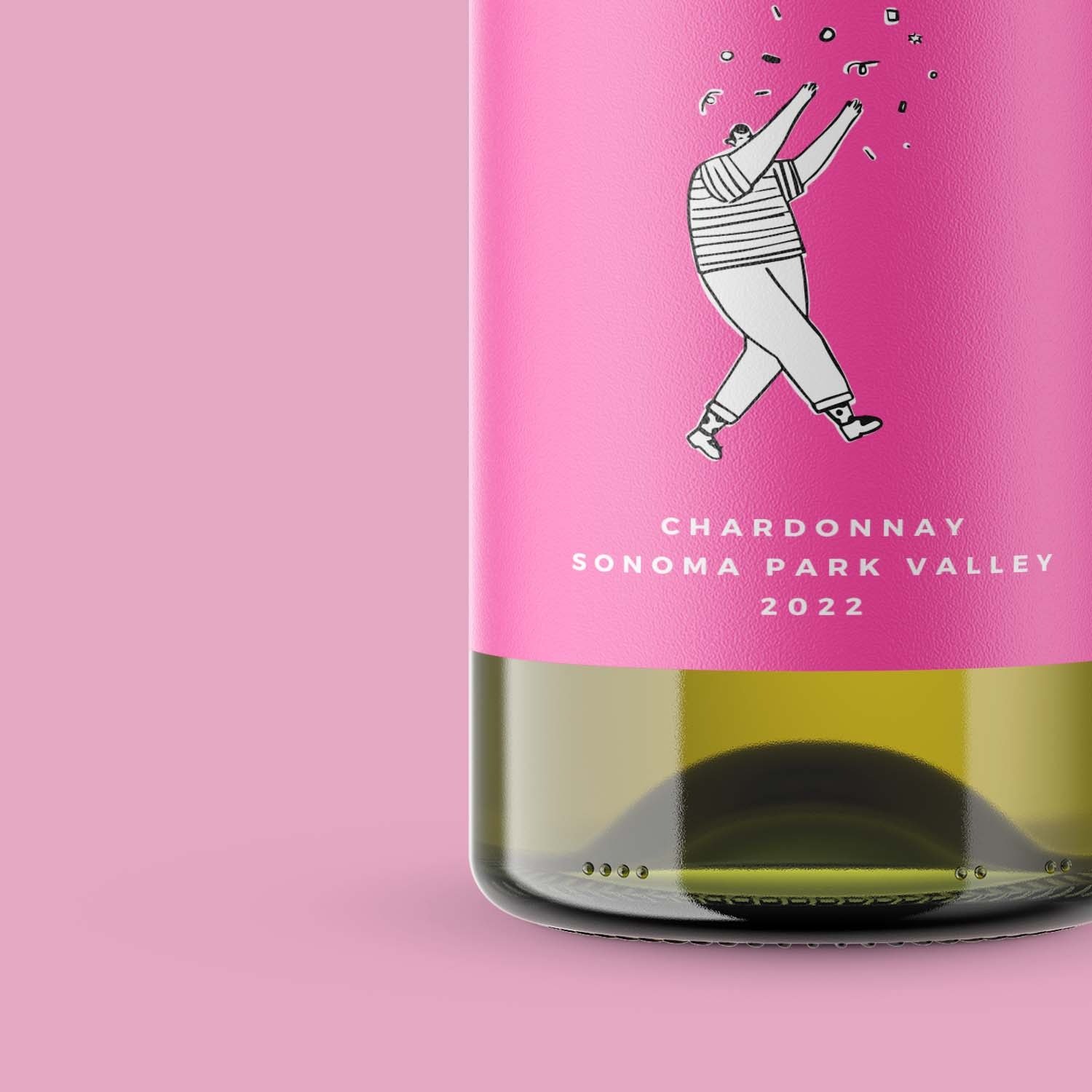
Your label needs the product name, the wine type if it’s not obvious, alcohol content, and your producer’s name or ABN. You need a country of origin statement too, “Product of Australia” or similar. Any added substances or allergens must be listed. It sounds straightforward, but fitting all this into a design that actually looks good, that’s where things get tricky.
A lot of producers think they can just cram everything into tiny text at the back. You can do that technically. But tiny text screams small operation. It also makes life hard for retailers and customers trying to read the label. A properly designed label gives you space for compliance info without killing your brand.
See also: The Rise of Voice Recognition
Material Matters More Than You Think
Paper’s the standard for wine labels because it’s affordable and looks professional. But paper has limits. Wine bottles get cold, they sweat, they sit in damp cellars. A standard matte paper label can warp or peel in those conditions.
Water-resistant labels are an alternative. They’re printed on a synthetic substrate that handles moisture and temperature swings without looking cheap. For premium wines or products sitting around for ages, this investment often pays for itself through better shelf presence and fewer damaged labels. The catch is cost. Water-resistant labels cost more per unit than paper, so you need to decide if the durability’s worth it for your wine.
Colour, Finish, and Readability
Wine’s all about visual appeal. Deep colours and good finishes catch the eye. But here’s where compliance and design have to actually work together.
Your label needs enough contrast between text and background so the mandatory information is actually readable. Black text on dark burgundy works. Pale yellow on white doesn’t. This isn’t just about looks; it’s functional. A retailer or customer should read your alcohol content and producer details without squinting.
Gloss finishes look premium, but they create glare that makes small text harder to read. Matte finishes are better for readability, and they hide printing imperfections too. Most producers find matte works best when you’re balancing visual appeal with compliance info.
Skip background images or watermarks behind required text. They wreck readability and can cause compliance problems. Keep mandatory information on a clear background, even if the rest of your label is visually complex.
Design Constraints are Actually Opportunities
Here’s the thing. Yes, regulations limit what you can do. But they create a level playing field. Every NSW producer faces the same requirements. The brands that win are the ones treating compliance as a design challenge, not an obstacle.
Think about making mandatory information part of your story. A smart producer might tie alcohol content into the vintage narrative. Your allergen statement doesn’t need to be hidden in tiny print. Design it with purpose, showing customers you actually care about transparency.
The back label gives you flexibility. The front is where your brand lives. Successful NSW wine producers use this split perfectly, front label for emotion and brand, back label for substance and compliance.
Your Next Steps
Start by listing everything that has to appear on your label. Measure the space you’ve got. Find a designer who actually knows wine labelling in Australia, not just general label design. They’ll understand the regulations and how to design around them properly.
Think about your positioning. Selling premium wine that sits in cellars for years? Water-resistant labels probably make sense. Younger brand with faster turnover? Paper’s fine and keeps costs down.
Get a sample approved before you print thousands. Have someone who doesn’t know your brand read the mandatory info easily. If they struggle, so will retailers and customers.
Wapping Up
The compliance part isn’t actually hard once you know the rules. The real skill is designing a label that respects those rules while creating something memorable. NSW wine producers who nail this balance find that regulation becomes an advantage, not a headache. Your label tells customers you care enough to meet every requirement properly. That kind of attention builds trust before they buy the bottle.
That’s the opportunity hiding inside the constraint.